Designing an attractive, competitive, and a provocative user interface is a huge challenge for the design industry. It doesn’t matter if that is a physical product or a software product. It’s a colossal discipline with lots of mental effort and it is very difficult to state that how long really it will take to behest a good UI design.
It takes time, lots and lots of practice and dedication to master this skill. If I talk from the perspective of a software developer then, you must be familiar with the software principles that we follow. Well, designing and developing is like “chalk and cheese ” but if you consider yourself a good software developer then you must ken the basics and fundamentals of UI design for your application, which should be simple, easy, and interactive.
In this article, I will try to highlight some of the important points while designing a mobile application UI, how to create a user interface that stands out in the crowd, should be engaging, beautiful, and can create an emotional response.
Also, Read: Adobe XD is now available for free – A software for UI/UX designers
Here are some tips:
1. Consider Your App as a Journey
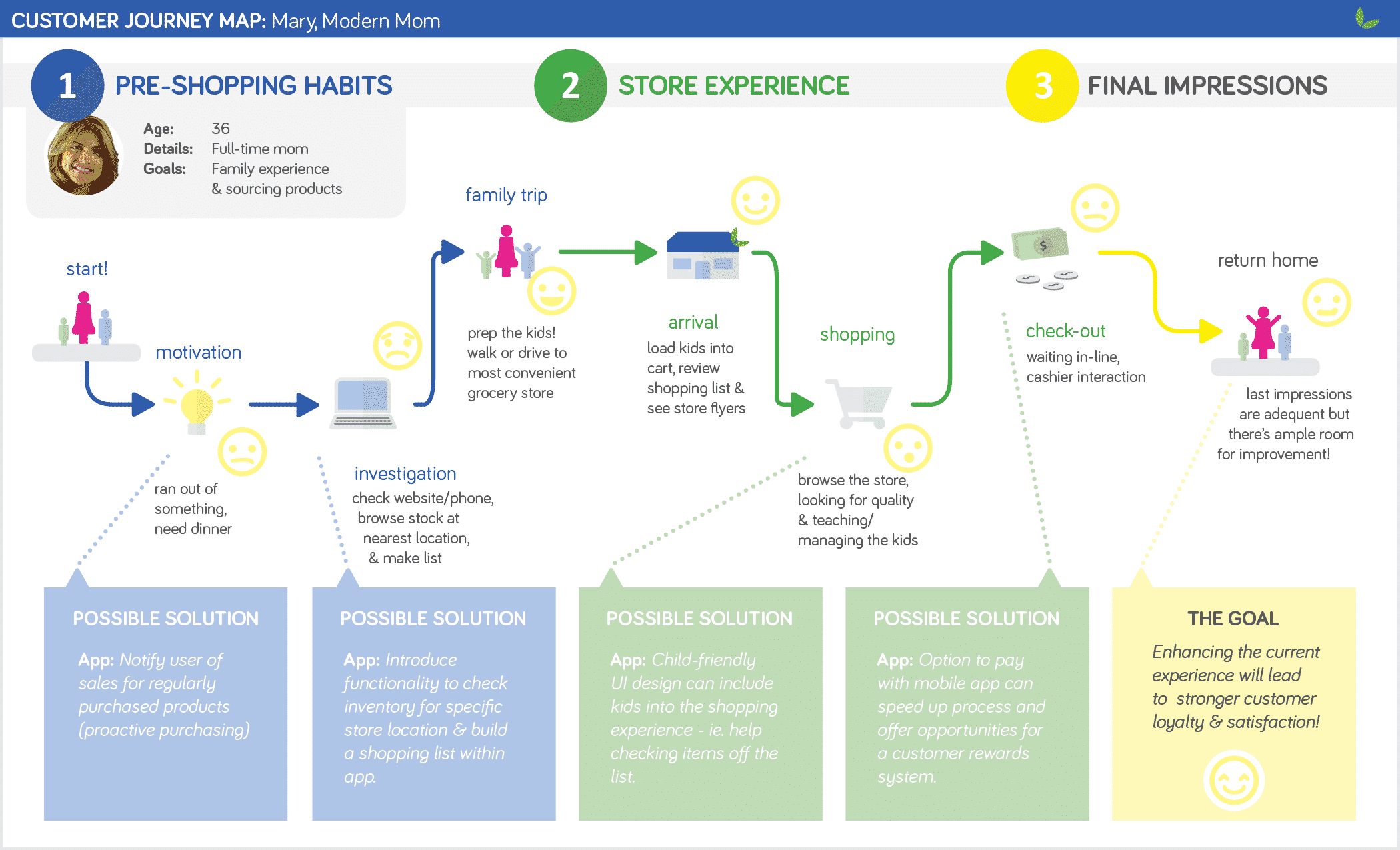
Every single user who uses a website or downloads your app right from the app store or the google play store uses it, achieves the goals or completes the tasks within the app or website. These all tasks should be in a flow like a journey. The user experience must be smooth, and intriguing. You, as an app designer is the craftsmen who will be responsible to design this journey.
You have to design the app or site in such a way that you are the tour guide in the app without your presence. It is very irrelevant to put each and every piece of information in a single page and think that the user will pick it up from there. In order to accomplish your goal, you should be able to shift and move the user’s attention from place to place guiding from the page A to B to C.
As a human, our attention is programmed in such a manner that our eyes get attracted to the biggest, boldest, and brightest then it moves to the rounds things and then to smaller things and at last to the lighter shaded things. As a designer one can use this information to curate an experience that best suits a user. A well-designed webpage or an app should be a visual journey. The design should follow a certain path like first there should be title then sub-titles and then followed by some beautiful images. One of the best examples of this is the “medium.com”.
One of the benefits of having such a design pattern is that it will increase the user retention for that app or site. Everybody gets bored while reading long and boring texts with no visual graphics. So, formatting your design is the key to success in the flow creation.
2. Mind Your Alignments
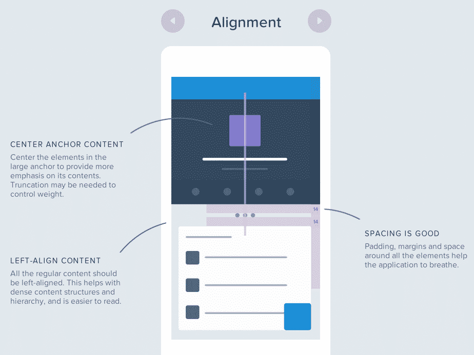
Have you ever wondered if your nose were above your eyes then how would you look? Well, of course, a creep and out of this world. Aligning the elements in a webpage or in an app is the fundamental design concept that plays a tremendous amount of role for a better user experience.
This is something that is imagined as a low effort task but wrong aligned things make a huge difference in terms of quality in the design. Wrong alignments can be considered as a cake without the icing on top. It actually harms the entire look and feel of the UI. Aligning things right is the key to any sort of graphical design also incredibly important in the digital design. Basically, there are two types of fundamental alignments.
- First is called the “Edge Alignment“ where all the elements are lined up one side with a single line. For example:
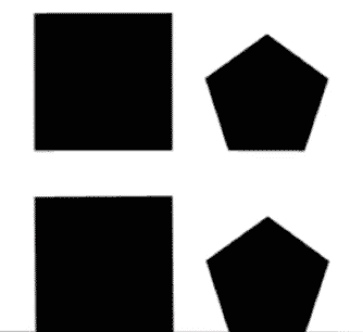
- Another one is the “Centre Alignment” where we line up all the elements by their midpoints.

In terms of user interface for a mobile application, you should consider the edge alignment. The alignment makes the design clear and a lot easier for our brain to interpret, understand and remember things better. For example, let us consider a business card shown below.
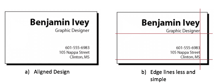
From the above image, we can figure out that, how the different elements and text are aligned which simple to retain in mind and can be easily understood without getting confused. This sort of design looks more pleasing to the eyes. Almost every design tools like Photoshop, Coral Draw etc. come with the guide that helps us to align out elements in a much better position.
3. Proper Use of Highlighting Elements In Interface Design
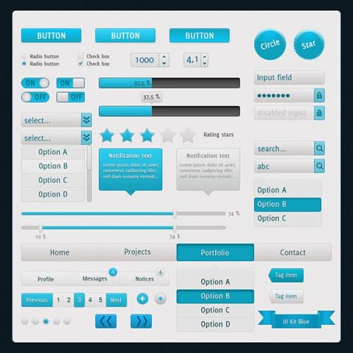
Now there are lots of clicking elements in any site or app, for example, a button in the form of an image, rectangles or circles. There are sliders, switches, navigation docs and many more. While designing such elements there are certain notable things that you should keep in mind.
You should always design in a way that, they give the user the hint that how that can be interacted with. Giving a shadow underneath the button, animations, or proper image for an action is the key to achieve this goal. The lighting effects should also be kept in mind that how much it should be in contrast to the background or the page. This is important because it enhances the interaction and creates an immersive user experience.
These kinds of effects tend the user to feel like as they are talking to the digital graphics, and it creates a realism on those lifeless elements. Moreover, it acts as a reminder for the user that they need to press this element in order to perform his/her desired task.
4. Use of Proper Fonts
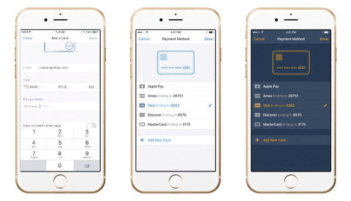
In order to better the interface elements, texts with proper fonts play a major role. In design, there is a golden rule i.e Functions comes before Form in all cases.
So, whenever you are sacrificing the function for a form then you should always think for couples of seconds before doing so. What I mean by this is that always be more devoted to the ease of implementing functionality in the user elements. One way to achieving the above words is by setting the correct fonts with the proper size.
Choosing the right font for your web or mobile app is a very important and sensitive decision because it influences how your future users will perceive the app, and whether they will choose to keep it or uninstall it. There are certain points that you should keep in mind before choosing your font.
- It should be able to create a unique experience on all platforms whether it is an app on small or big phones or on desktop site version.
- It should be versatile i.e. it should be used in any font style without reducing readability or losing its appealing look.
- Use proper and different colors.
- A clear understanding of where to use bold, italic, underline fonts.
- Proper selection of different textures solid, outline.
- Consider Licensing Issues for the commercial apps
- Last, but not least, be thorough in testing your fonts before launching the app or site in all size of devices.
5. Colors In the User Interface Design
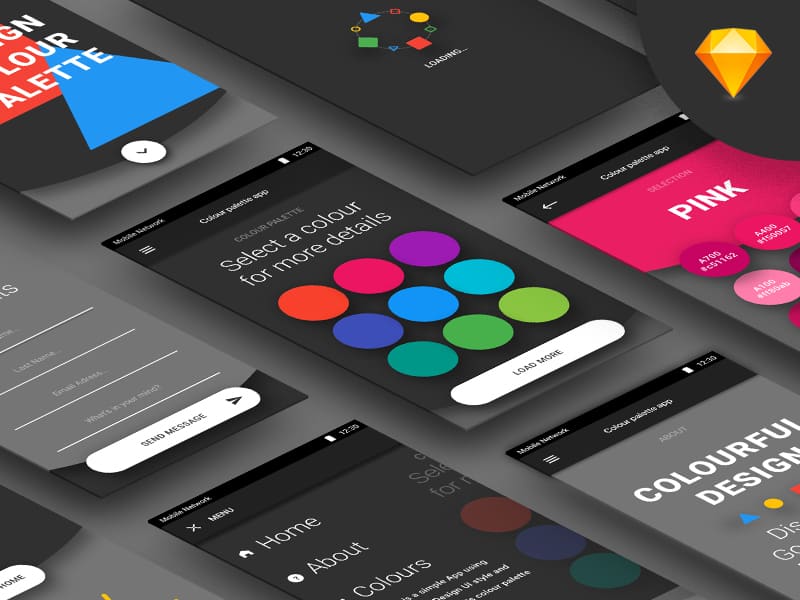
In order to design an interface that is truly eye-catching, proper selection of colors that are going to be applicable to the elements of the interface is a challenge. Not only the selection of color is a challenge but how to present those colors that will force the user to pay attention to a specific area is also a tiresome job.
It is very important to equally emphasize selecting the right proportion of hues for the app and site design. What is right and wrong in selecting a color can be a topic of debate but, most of the app designers follow the latest trends in app design while selecting the colors, which isn’t a bad idea.
While selecting colors for the Icon, you should always consider what kind of app that is? Also, picking up the right color scheme can be a critical job that you have got in hands thus when you go out for making the choice, there are different aspects that need to be taken into consideration such as color associates of your region and brand colors.

What you need to do is choose the simple colors to enhance the UX. The simple colors look pleasing to the eyes and at the same time, it becomes easier for the user to read the content. While selecting the shades of the colors, a designer needs to blend black with the base color. Its main objective is to make the mobile design more attractive.
Conclusion
So, we have evidently seen how different aspects of fundamentals of design plays their important roles while designing the User Interface and User Experience of any application. It can give your app a standout response in the market competition. Therefore, you have to give equal emphasis on each of the tips mentioned above to improve the overall design.


Thank you for sharing this post. Looking forward to read more.
రిప్లయితొలగించండిBest UX Design Services Company
UI Development Training
రిప్లయితొలగించండిUI Development Training in Hyderabad
UI Development Online Training
UI Development Training
UI Development Training in Hyderabad
UI Development Online Training
UI Development Training in Bangalore
రిప్లయితొలగించండిReactjs Training in Bangalore
Informative blog. Thanks for sharing.
రిప్లయితొలగించండిFull Stack Online Training
Full Stack Training
Full Stack Developer Online Training
Great Information! Here's a list of over 1000+ latest UI UX Designer Jobs in India
రిప్లయితొలగించండిNice Blog. Thank you very much for sharing this Amazing tips to improve user interface design of app.
రిప్లయితొలగించండిGreat Information.Thanks for sharing.
రిప్లయితొలగించండిBest Freelance UX/UI developer
Thanks for sharing..
రిప్లయితొలగించండిUi/Ux Company In Bangalore| UX Design Companies In Bangalore | UI UX Design Companies In Bangalore| Top UI UX Companies In Bangalore | UI Development companies bangalore | Best SEO Company in Bangalore | Best SEO Services Company In Bangalore | SEO Services In Bangalore |SEO Agency In Bangalore |SEO Services Company In Bangalore
Thanks for sharing a great tips!!
రిప్లయితొలగించండిMobile app development
Xamarin app developer Sydney
VR AR App development
Thanks for giving a good knowledge into the Interface and Design sections.
రిప్లయితొలగించండిUI UX Design Companies In Bangalore | UX Design Companies In Bangalore | Top UI UX Companies In Bangalore | UI UX Design and Development Company in Bangalore
Thanks for posting this information. It is very helpful for all of us. Keep updated with your blogs.
రిప్లయితొలగించండిDigital Marketing Services in Noida
Web Development Company in Noida
Website Designing Company in Noida
iOS Mobile Application Company in Noida
Mobile App Development Agency
Website Development Agency
eCommerce Development Company Noida
Thank you very much!! You have shared very good information with us.
రిప్లయితొలగించండిMobile App Design Services
Thank you for sharing such an informative and knowledgeable blog. UI and UX design services Toronto
రిప్లయితొలగించండిIts really helpful blog.